Continuing with our tour of The Broad… the 120,000-square-foot building features two floors of gallery space and is the headquarters of The Broad Art Foundation’s worldwide lending library, which has been loaning collection works to museums around the world since 1984. The Broad welcomes more than 900,000 visitors from around the world per year.
In an invited architectural competition for the project in 2010, six architects were asked to present preliminary designs. The participants included Dutch architect Rem Koolhaas and his firm Office for Metropolitan Architecture (OMA); the Swiss Herzog & de Meuron; Christian de Portzamparc from Paris; Japanese duo of SANAA; and Diller Scofidio + Renfro from New York. Diller Scofidio + Renfro were eventually chosen.
Enjoy this repetitive yet energetic tune while browsing.
The Broad’s architecture, conceived as “the veil and the vault,” integrates public exhibition space with the museum’s vast art storage, placing the usually hidden “vault” at the center of the visitor’s experience. This massive, sculptural volume is suspended within the building, shaping the lobby below and supporting the galleries above, while strategically-placed windows offer glimpses into the collection’s depths, blurring the line between display and archive. This issue of “display versus storage” was tackled by Herzog & de Meuron in the musuem – Schaulager, that they designed in 2003 in Basel, Switzerland. See our earlier post regarding the Schaulager.

Wrapping around the vault is the “veil,” a porous, honeycomb-like exterior that filters soft daylight into the galleries. Stretching across a full city block, this airy skin gives The Broad its signature look while creating a bright, climate-controlled environment for the art within. The interplay between veil and vault defines both the building’s aesthetic and the visitor’s journey.
Below are some more of the works that we saw in the museum. By the way, don’t miss Part 1 of the series.
Echoing the museum’s exterior element and the rhythm of Philip Glass’s music, let’s chat about this painting by Jasper Johns.
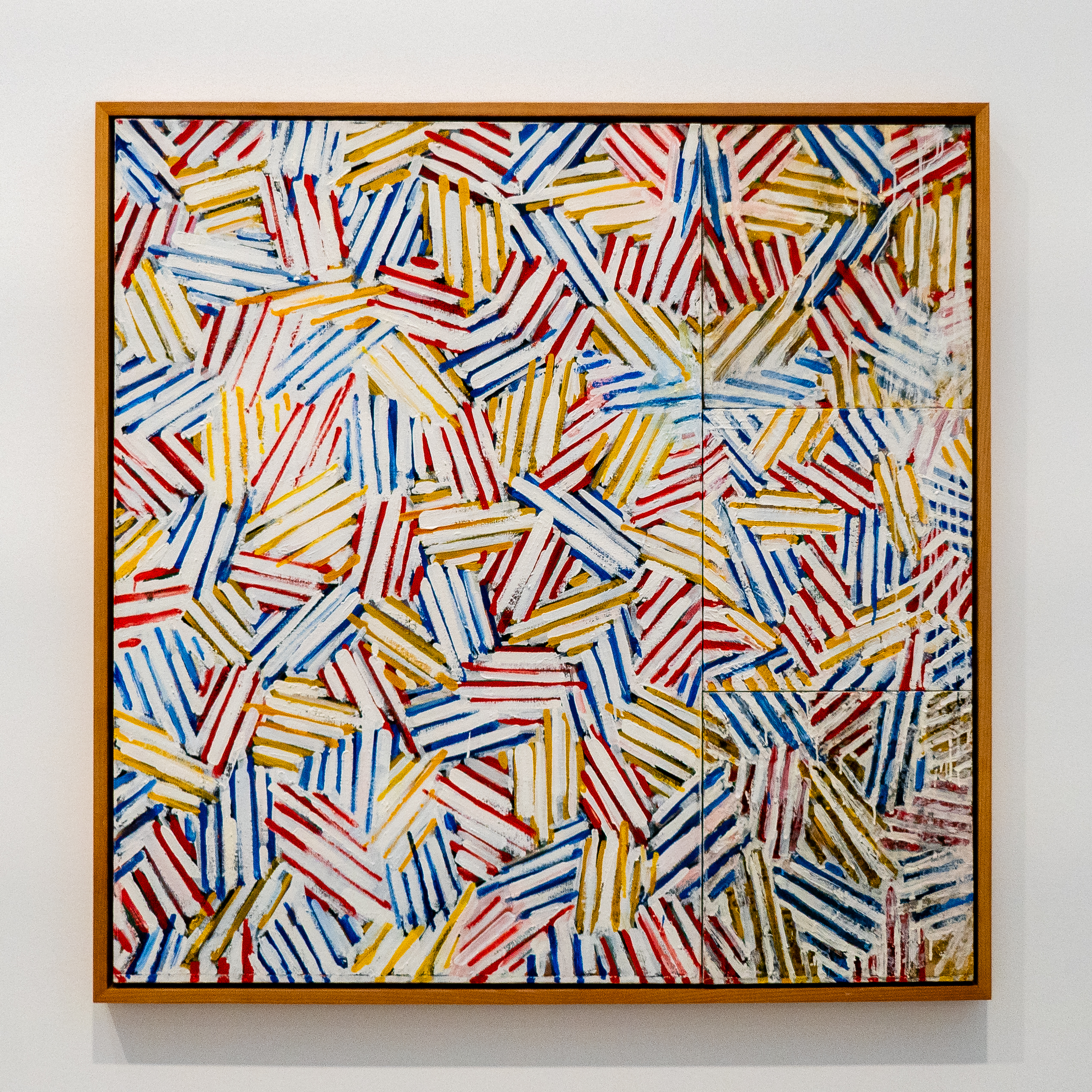
This late-1970 work comes from Jasper John’s series named “Usuyuki” (light snow in Japanese). It is made with layers of rhythmic hatch marks in layers of red, blue, and yellow to create a vibrant, almost woven surface.
We like many “random” things (if you know us), and the pattern here appears somewhat random. While there is repetition there is also intentional irregularity, our eye naturally tries to find a pattern but there is none, there is no place to start or stop. Yet there is some harmony in its chaos.
Chris appreciates all of Andreas Gursky’s large-format, high resolution photographic works, valuing them not only for their meticulous staging and technical mastery, but also—beyond that, most of the time—for the artist’s intended expression embedded within the imagery.

Andreas Gursky’s Dubai Stock Exchange (2008) depicts the bustling yet composed world of Middle Eastern finance, with hundreds of men in identical kanduras occupying a vast trading floor. To us, the scene stands in marked contrast to the high-energy urgency often associated with American trading floors. As in much of Gursky’s work, a specific moment—in this case, the operating machinery of capitalism “ka-ching”—is transformed into a repetitive and almost abstract pattern.
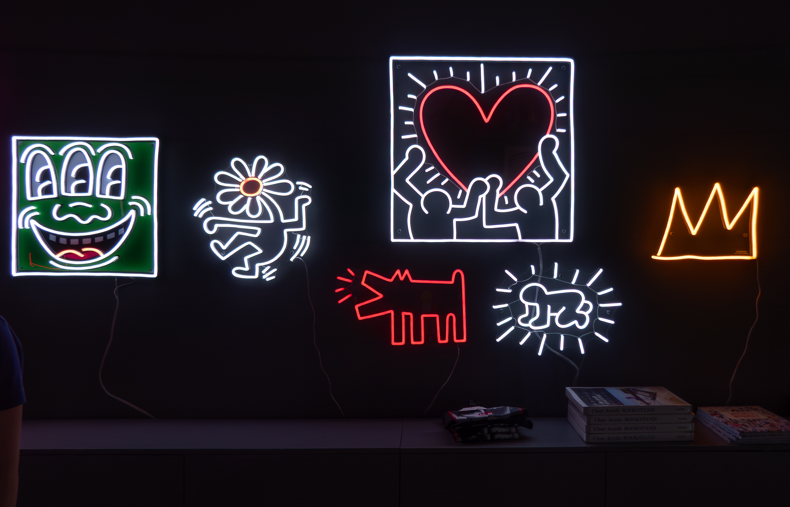
Greeting us in a darkened space, these neon signs are very lively and eye-catching, and the glowing tubes of light perfectly matches Keith Haring’s graphic language.
Neon Icons (c. 1989) assembles Keith Haring’s signature motifs—a crawling “Radiant Baby,” barking dog, dancing figure, pulsating heart, and gold crown. Rather than relying on color fields or brushwork, each element is rendered as a distilled expression of Haring’s pop-vernacular vocabulary.
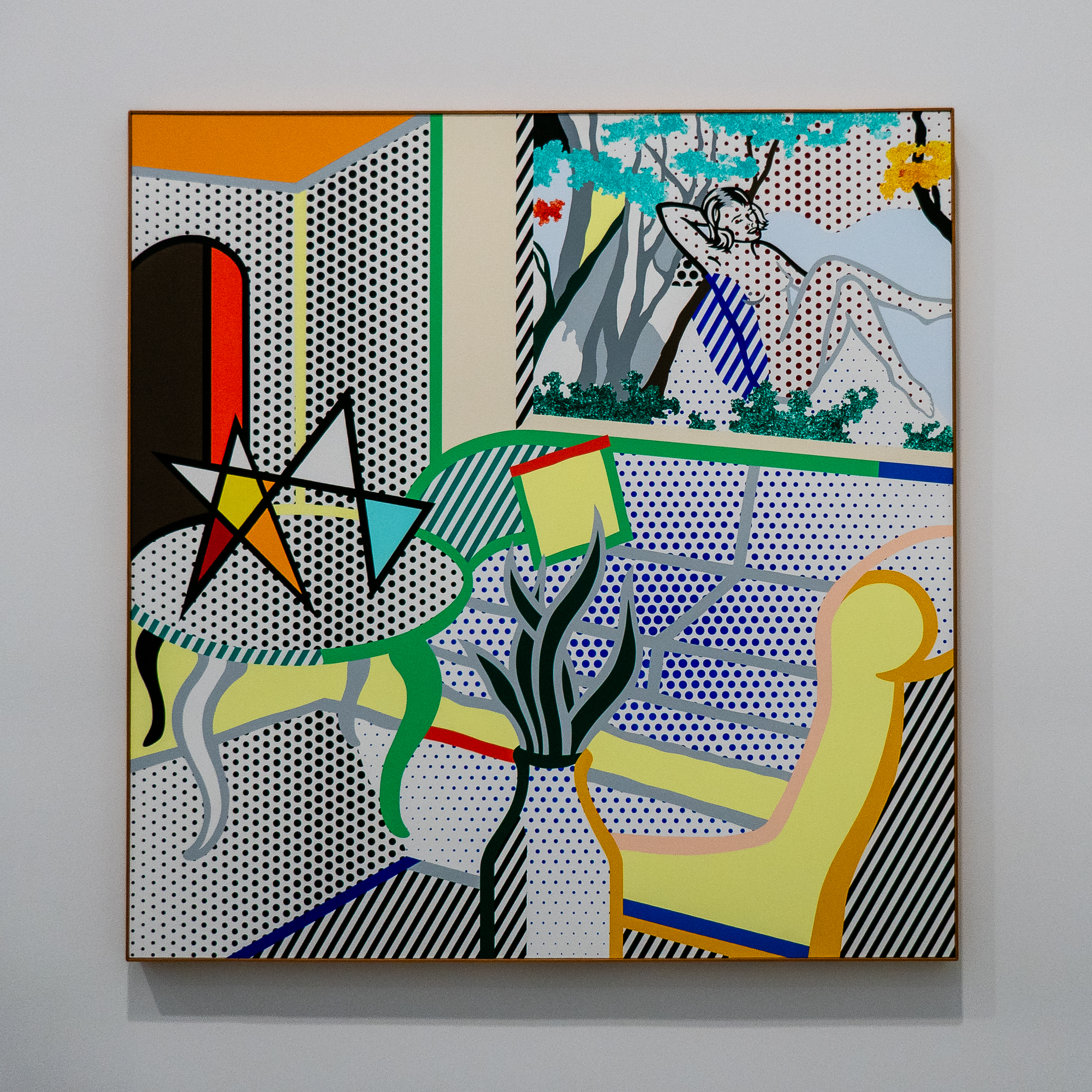
We are always amused by how Roy Lichtenstein deploys his Ben-Day dot pattern and bold black outlines to depict real-life imageries.
Here, in Interior with Water Lilies (1994), a late-career work, he reimagines a domestic scene as a comic-book stage set that includes a dotted nude painting on the wall.
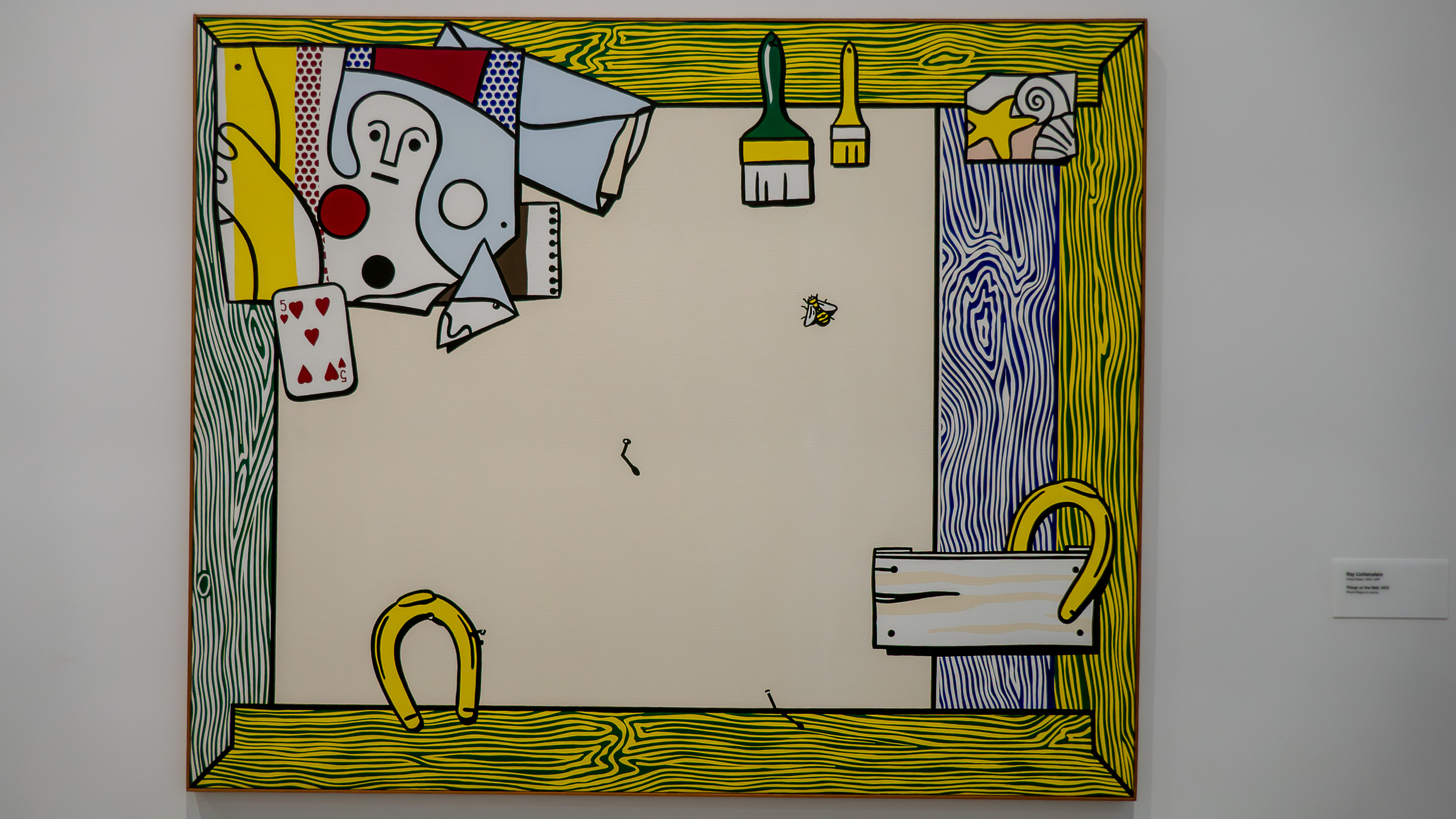
Roy Lichtenstein, Things on the Wall (1973) is a still life of his workspace(?) made in his own conventions. Painting a frame with wood grain, he is playfully merging the boundary between a painting and its display.
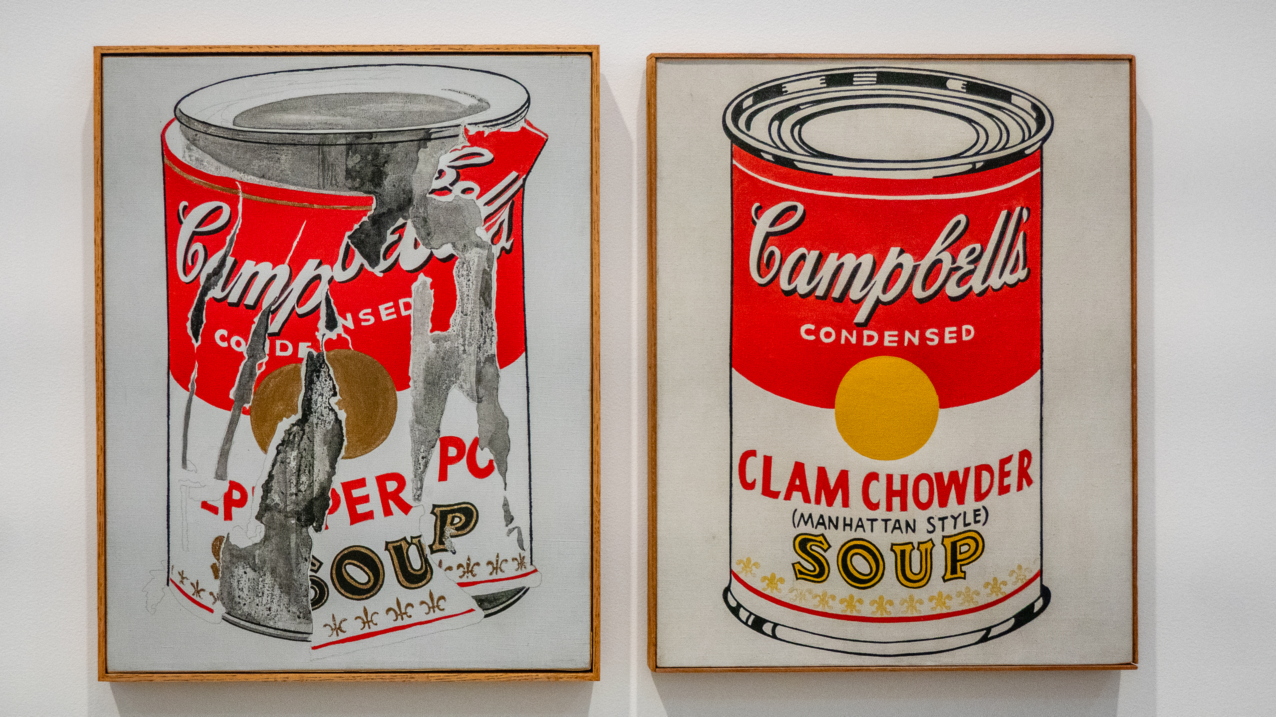
We admire the meticulously rendered labels in Andy Warhol, Pepper Pot & Clam Chowder (Manhattan Style) (1968). Nothing surprising here.
Warhol’s twin Campbell’s soup canvases riff on his own Pop-Art iconography by pairing an intact Clam Chowder can with its peeled-back Pepper Pot counterpart. Just variation on a theme.
This concludes our visit to the Broad, a museum not to be missed and we forgot to mention, general admission is free !
If you missed Part 1 of this series, it is here.